With the seemingly endless eateries around, it's hard to figure out where to eat. When you introduce time constraints - having a timed lunch break during work or a small break in-between classes - it's difficult to figure out if you can even reach the place. And when you introduce other people to the mix, the planning process can be infuriating. As a result, finding a place to eat can be time-consuming and overwhelming.
Feasty streamlines the food-getting process by showing you reachable locations for food within a given time constraint.
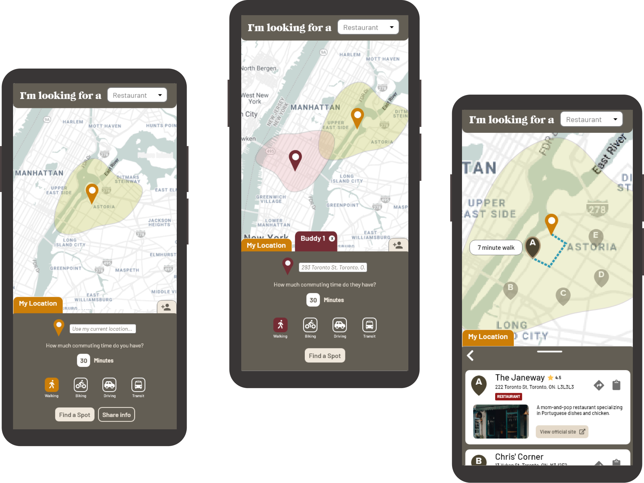
Feasty grabs eateries that can be reached within your specified time-frame and your mode of transportation from your current location or an inputted address. It also helps find a reachable place between you and your friends. Add up to three friends on the map, their travel time, and their mode of transportation and watch as Feasty will pull food locations that everyone can reach in time.
USER RESEARCH
We interviewed four people of different ages and socio-economic statuses and conducted two observational studies. We saw a mutual opportunity area of frustration around both the solo and group experience of looking for a place to eat.


Convenience and familiarity are king
People are more likely to grab food from close, familiar places due to time constraints (work, school, etc.),

Planning food outings is frustrating
The existing process uses multiple apps, and meeting up with friends to eat requires coordination and brainstorming

Decision paralysis plagues the process
Having too many places to choose from makes deciding on a place even more tough

Food is tied to socialization and emotion
Many associated socialization, friends, enjoyment with food - and anger, loneliness, and solitude with the absence of food

Food-finding is fun and familiarizing
Trying new cuisines and places is enjoyable and helps familiarize people with their current location

Mobile phones are the tool of choice
Mobile applications are used to find food places over any other platform
Looking over our research, we made a plan for things that we needed to address.
• the most-used tool to find food places was a smartphone, so a mobile application would be the best platform for our product
• we needed to prioritize convenience and familiarity - two key words that came up a lot in our interviews
• we had to look for a way to simplify the choices would also help to address choice paralysis
• the intrinsic fun in trying new food places and exploring your current location should be weaved into our product
• finding a way to both expedite and simplify the food-with-friends planning process would increase the use cases and marketability of our product
PERSONAS & MARKET RESEARCH
I crafted 3 personas that reflected our research findings. They helped to clarify that our product's features would be solving real problems that different users were facing in the food-finding process.

To access full versions of my 3 personas, click the condensed persona card above.
We looked for mobile applications that integrated a map into their functionality to model our UX and interactions after other more popular applications.

The map takes priority.
Being the focal point. it takes up most of the screen. When the map is interacted with, other UI elements disappear or move out of the way of the user.
Interactions are along the top and bottom.
Usually the top is reserved for searching, while the bottom is for filtering and directions. Swiping up is commonly used as a way to expand menus.
Map styling is similar.
Pins are used to signify places of interest for the user. Current location is always marked clearly (usually a blue dot). The map is usually mostly neutral/light grey with pops of colour to signify the type of geographical location it is.
IDEATION
We created a Miro board to map features and priorities for our product, split into 3 categories of features that we saw were important from our research. Due to our deadline, we prioritized creating a strong MVP first - and that meant leaving 2 features undeveloped in our solution.

To generate features, we created a Miro board and split it into 3 main categories that we wanted to address. This helped us create features that had solid rationale behind their inclusion.
We decided to leave two features out because they were too complex to code. They would be great features that would bolster our product, but due to our timeline we prioritized generating a strong core product first.
I crafted all the design work from sketches to the final product. I was also responsible for all the HTML, CSS, and implementing Hammer.js into our project.
My partner was a strong developer, and she was responsible for all of the complex API JavaScript work that made up the core function of our product. Without her, the product certainly would be a lot rougher than it turned out.

We started to source APIs that would help us achieve the features we needed. My partner was instrumental in figuring out how we could meld together multiple APIs to achieve our vision.

Mapbox →
Mapbox gives us an interactive, styleable map to use as the base of our application.

TravelTime →
TravelTime provides isochrones that filter out unreachable locations (customizable by transportation method).
MapQuest →
MapQuest gives us a location database, and codifies them by their type (e.g. cafe, restaurant, etc.).

Hammer.js →
Hammer.js allows us to incorporate common touch and swipe gestures into our app.
DESIGN & USER TESTING
Being a team of only two people, technical achievability of the design was front of mind when I designed the application. We included user testing with 5 people and I synthesized our findings into key design adjustments to bolster the effectivity of our product.


CHALLENGES
When we were coding the project, we found that we had to cull back or adjust some features to make sure we met our project deadline.
KEY FEATURES

Quickly and easily generate reachable food locations from your location or an entered address, and tailor the results to your mode of transportation (walking, driving, cycling).
Add one or more friends to the mix by entering their details into their own tab. Feasty will find food places that you can all reach to make sure you can all stuff your faces.


Refine the location results using the drop-down filter at the top to find exactly what you've been hankering for - whether it's a snazzy restaurant or a cool, intimate cafe.
Easily save the perfect location for you or your friends to grab some grub. Just press the clipboard icon beside the details and Feasty will copy all the details you need to your clipboard.

FURTHER REFINEMENTS
After handing in the project to my professor, I decided to make some adjustments to Feasty using the data from our user testing to better address user needs.
60%
of testers said the process could be streamlined more.
"It solves part of the problem for me. But I still have to do the song and dance of talking to people, gathering info about their whereabouts, etc..."
"The process is still a bit clunky because yes it copies the address, but then I have to exit this app then open Maps."
80%
of testers said that they want more information about the chosen place.
"It feels a bit incomplete. Like, it's nice I can see where it is but I would need more information to decide on going there or not."
"Is there a way you can give us more info about where we're about to eat?"
100%
of testers were confused as to why there was no public transit support.
"I get around using public transit pretty much all the time because I live downtown, so it doesn't really make sense for me to use this."
"Almost everyone I know uses public transit - I do know people who bike and walk everywhere but they're definitely the minority."

Public transit support.
By adding transit support, we're addressing a core group of users (commuters) who would benefit from using our application to find food.
Improved touch areas & contrast.
The previous version suffered from small button sizes, improper spacing, and contrast issues. I made touch areas bigger, clearer, added space between the elements, and increased the contrast to improve accessibility.
Added a 'share info' button'.
Users can now share their location, commuting time, and mode of transportation through a link that can be shared with friends to input your info quickly into their app.

Expand a card for more information.
Tapping a location's card 'focuses' on that location by providing visualized routing and travel time, options for directions or copying the address, as well as relevant external links. This gives the user more control over their process.
Adding support using external sources and apps.
Relevant external links (official site, pictures), reviews (Yelp/Google), and apps (direction icon puts address directly into Google Maps) help the user make a more informed decision while also streamlining the process.

Streamline the process with internal links.
When a friend sends you their information using a link from the 'share info' button, Feasty will automatically import their information into the app - making the process of planning food outings with friends even easier.
IN CONCLUSION...
This was my first long-term project and my first project where I contributed to the delivery of an actual product with coding. It was great discovering an opportunity area through our research and then tackling it directly with a solution that had an observed impact on its potential users. I learned a lot about developing from my amazing teammate, and got to experience the pressures of working on a product end-to-end with a deadline.
I gained valuable experience in refining designs with user testing.
We involved user testing at every point in our development. It helped us refine our design early on before we got too invested, and helped to create a more refined, usable product that solved pain points of our potential users.
It exposed me to working with a developer.
As a designer, my career will be full of working with developers of all kinds. My partner was a really talented developer and allowed me to focus on all the design work. I also did the HTML and CSS, and she was a great person to ask about it if I had any questions.
I dealt with designing based on our product deadline and API limitations.
As we moved into making and troubleshooting code, we found ourselves having to cull and adjust features to meet our deadline. It was a good reminder to always be open to change in the design process, and to figure out the limitations of your APIs as well.
CLOTHELY
HABANERO CONSULTING GROUP